Getting Started
All Inpulse UI icons are available as SVG files and React components, making integration into your projects seamless and hassle-free.
Usage
As a React Component
All icons are available as individual React components. Install Inpulse UI Icons from NPM:
pnpm add @inpulse-ui/iconsbun add @inpulse-ui/iconsyarn add @inpulse-ui/iconsnpm install @inpulse-ui/iconsCopy the React name of the icon by clicking on the title, above. Then, import the icon into your React project and enjoy!
import { Infinite } from '@inpulse-ui/icons';
function Demo() {  return (    <div>      <Infinite className="w-6 h-6 text-blue-500" />    </div>  );}
Inpulse UI bundling is optimized for tree shaking. This means that when importing an icon, most modern javascript bundlers like Rollup, Webpack and Vite can detect that only Infinite is being used, shipping to consumers only that piece of code.
- Only the Infinite.js file will be imported (~650 bytes)
- It will NOT include all other 535 icons
- The bundle will remains optimized
As SVG in Figma
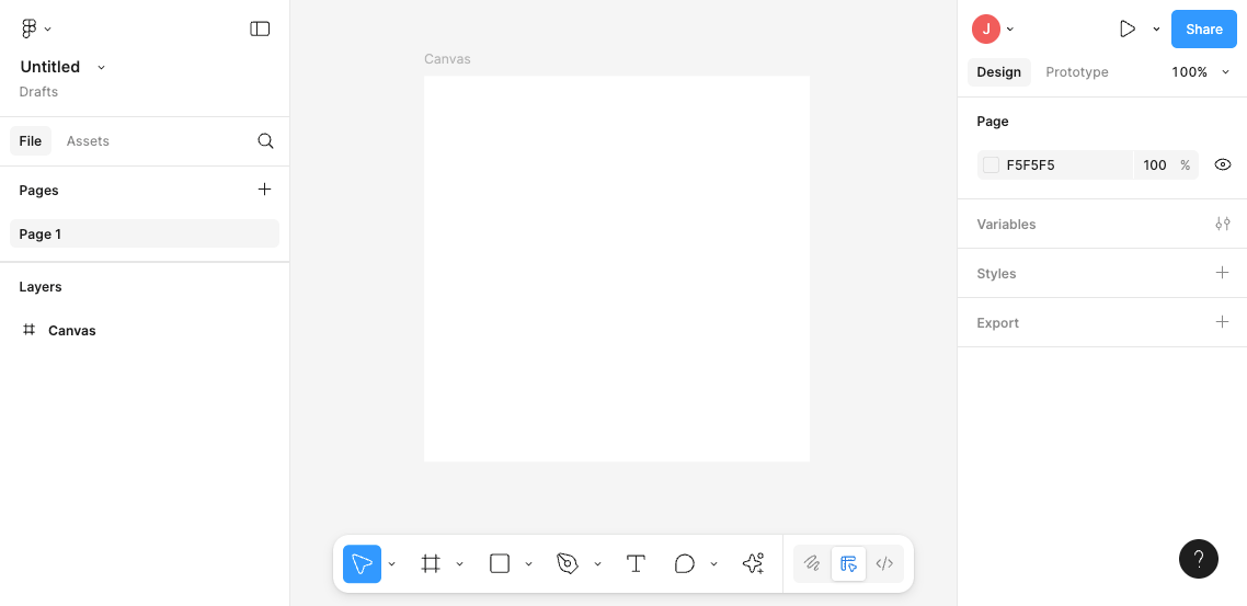
Copy the React name of the icon by clicking on it. Then, paste it onto the Figma canvas to use it in your designs.

Customization
Section titled “Customization”It is possible to customize the icons by changing their size, color and stroke width. You can do this by applying tailwind classes.
You can easily change the size of an icon by using the w-{size} classes.
import { Infinite } from '@inpulse-ui/icons';
export function Demo() {  return (    <Infinite className="w-6" />{/* 24px is the default size */}    <Infinite className="w-12" />    <Infinite className="w-20" />  );}
Set custom colors using the text-{color} classes.
import { Infinite } from '@inpulse-ui/icons';
export function Demo() {  return (    <Infinite />{/* Default */}    <Infinite className="text-primary" />    <Infinite className="text-teal-500" />  );}
Defined line thickness using the stroke-{width} classes.
import { Infinite } from '@inpulse-ui/icons';
export function Demo() {  return (    <Infinite className="stroke-[0.5]" />    <Infinite className="stroke-1" />    <Infinite className="stroke-[1.5]" />    <Infinite />{/* 2px is the default */}    <Infinite className="stroke-[2.5]" />  );}
Overwriting styles
You can set a default line thickness for all icons in your project by adding the following CSS to your global styles:
@layer base { svg path { stroke-width: 1.5; }}Built with by Jo Santana in Brazil.
© 2026 Inpulse. All rights reserved.